
0 Comments
My Monthly Hero Arts | January 2020 | 10 Cards 1 Kit | Part One
Today I'm showing the versatility of the My Monthly Hero Arts January 2020 card kit. The kit is floral themed, so you can really create a card for any occasion. I love that the stamp set includes many different sentiments that coordinate with the banner die that came in the kit. This is a truly elegant kit and I had a lot of fun working with it. I think my cards turned out rustic and elegant. Let me know in the comment section which card was your favorite.
All of the flowers were die cut from white card-stock and the leaves were cut from green card-stock. I added my own colored inks to the flowers and leaves. For me, this was the easiest and fastest approach for creating my 10 cards. I also liked that I was able to choose the exact colors that I wanted for my cards. Alternatively, you can cut your flowers from colored card-stock to avoid getting inky!
All of the flowers were hand colored with various colored inks by Altenew. Altenew inks come in packs of four or six. Each pack has one color in multiple shades, so you can achieve very dimensional looking flowers with these inks! For all the greenery and some of the flowers, I decided to add shading to them with my copic markers. The copics were much less messy especially for those skinny stems on the flowers! My copics were also useful in adding some dimension to my white flowers. I felt that adding grey ink to my white flowers would make them too dark, so that's why I opted to use copics instead.
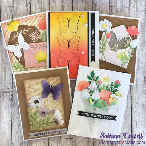
Card One:


Isn't card one a beauty? My goal for this card was to create a wedding bouquet. Note, most of my arrangements are Pinterest inspired! I searched bridal bouquet and almost all of them had some pink flowers, so I included some white roses as well as some coral roses into my bouquet. I also mixed in some yellow baby's breath and lots of greenery! The flower wrap is made out of vellum, which was embossed with a polka dot embossing folder. The white background was embossed with the same folder. I white heat embossed "congratulations" on a black die cut banner and adhered that right over my flower wrap. To finish the card, I scattered a few pearls. I thought they added an elegant touch to my cards!
Card Two:


The "prettyness" continues with card two, which features the envelope die that came in the kit. I die cut the envelope from some of the pink shimmer card-stock that came in the kit. Before gluing the envelope together, I went ahead and die cut the butterfly die from the center and the flap of the envelope. This created an awesome butterfly shaped window on my envelope! Behind the window, I glued some acetate as well as some polka dot embossed vellum. (I had some left over from card one). I love this effect. The butterfly looks textured, but the acetate creates a smooth barrier in front of the vellum! In front of my envelope I attached some more flowers and greenery. I tried to position the florals so that they framed my butterfly. I white heat embossed the sentiment "Thinking of you" onto a black die cut banner, and added a purple butterfly beside it. The background was created with the newspaper stamp and some clear embossing powder.
Card Three:


I absolutely loved my first cards rustic wedding theme, so I decided to do another wedding inspired card. This time, I searched "wedding stationary" on Pinterest to see what the latest trends are for wedding envelopes. I saw a lot of envelope cut outs backed with vellum. I loved the look, so I tried my best to emulate those. I think it was pretty successful! What I did was first die cut two envelopes, one from shimmery pink card-stock and one from kraft card-stock. Then, I die cut a leaf image from the top flap of each envelope and backed the cut out with some vellum. I decided to close the pink envelope with a yellow "wax seal" flower. For the kraft envelope, I cut the bottom off and the side flaps. That way, I can adhere the envelope completely flat onto my card panel. I left the top flap of the envelope open and also added a yellow flower to the top of it. To finish it off, I added a cute birdy stamp. I then collaged all of the pieces together. I added some florals and greenery, as well as a white butterfly to the mix. The background panel was created the same way as card two. I just stamped the newspaper stamp with brown ink onto cream card-stock. I ink blended the edges of the panel with the same brown ink to make the paper look vintage.
Card Four:


After spending hours on my first three cards, I decided that it was time to create a more simple design. For this card, I started by ink blending onto some white Nina card-stock cut to 3 x 5.25 inches. I used the same altenew inks that I used to color all of my florals. I decided to create a gradient going from coral to yellow. Altenew inks are die inks, so they blend fairly well. Obviously, distress inks/ oxides would also work fantastically! Once I finished ink blending, I die cut three butterflies down the center of the strip. I adhered the die cut panel onto some black card-stock that was cut to 3.25 x 5.25 inches. To give the butterflies some sparkle, I added gold glitter to their wings with a sakura glitter pen. I also colored in their bodies and antennas with some black ink. I adhered each butterfly back into the areas I die cut them from, so it's sort of an inlay. I only added glue to their bodies, that way their wings would pop out and reveal the black card-stock underneath. I popped up the entire panel with some foam tape. I added my sentiment banner next to the ink blended panel. I like that the sentiment is sideways, it's kinda different than what I would normally do! To finish the card, I scattered a few pearls around my butterflies.
Card Five:


In my video tutorial, I mentioned that I like to make my sympathy cards pretty muted. I try not to add bright colors, or over embellish my cards. Here's an example of a sympathy card that I would typically make. I chose some earthy colors, and kept the card relatively simple. I started this card by creating the background the same way I did for card three. On the bottom left corner of the panel I added my florals and greenery. I chose to color them in grey and light purple tones. I created a wide kraft border with some stitched rectangle dies to frame in my design. Behind the frame, I added some acetate. I love how acetate instantly makes a card look more elegant. I popped up my frame with foam tape. On top of the acetate window I added two butterflies. Finally, I stamped my sentiment with purple ink onto a grey die cut banner and added that to the bottom of the card.
Video Tutorial
Supplies
NOTE: I am using affiliate links for the products listed below. If you decide to use these links, know that I will receive a small commission off of your purchase. This is no added cost to you as the consumer, it's just a way for us crafty friends to support one another!
Unfortunately, the Hero Arts January 2020 card kit has sold out. The only way to guarantee getting a kit by Hero Arts each month is to be a monthly subscriber. Below, I’ve included a link to join their 1 month, 3 month or 6 month subscription. I’ve also provided links to extra supplies I used in today’s video. I hope my video has inspired all of those who purchased the kit, as well as others! We all have at least one floral stamp/die in our stash right?
Card One:
- Altenew “Pretty in Peach” 6 mini cube set ( I used blush and pink pearl)
- Altenew “Pocketful of Sunshine” mini cube set (citrus burst & fresh lemon)
- Altenew “Green fields” mini cube set ( frayed leaf & forest glades)
- Fun Stampers Journey “Vellum”
- Spellbinders “Tiny Dot” embossing folder ALTERNATIVE
- Fun Stampers Journey “White” embossing powder
- Trinity Stamps “Bright White Smooth Pearl” embellishment mix
- Picket Fence Studios “Life Changing Blender Brushes” 10 pack
Card Two:
- Picket Fence Studios “Life Changing Blender Brushes” 10 pack
- Altenew “Pocketful of Sunshine” mini cube set (citrus burst & fresh lemon)
- Fun Stampers Journey “Vellum”
- Spellbinders “Tiny Dot” embossing folder ALTERNATIVE
- WOW Clear Embossing Powder
- Sakura “Stardust” clear glitter pens: http://shrsl.com/22dmp
Card Three:
- Picket Fence Studios “Life Changing Blender Brushes” 10 pack
- Altenew “Pocketful of Sunshine” mini cube set (citrus burst & fresh lemon)
- Altenew “Pretty in Peach” 6 mini cube set (I used blush and pink pearl) : http://shrsl.com/22dle
- Fun Stampers Journey “White” embossing powder
- Memento “Toffee Crunch” dew drop ink
- Fun Stampers Journey "Vellum"
- Sakura “Stardust” clear glitter pens
Card Four:
- Picket Fence Studios “Life Changing Blender Brushes” 10 pack
- Altenew “Pocketful of Sunshine” mini cube set (citrus burst & fresh lemon)
- Altenew “Pretty in Peach” 6 mini cube set (blush & pink pearl)
- Fun Stampers Journey “White” embossing powder
- Trinity Stamps “Bright White Smooth Pearl” embellishment mix
- Sakura “Stardust” clear glitter pens
Card Five:
- Picket Fence Studios “Life Changing Blender Brushes” 10 pack
- Memento “Grape Jelly” dew drop ink
- Memento “Lulu lavender” dew drop ink
- Memento “Toffee Crunch” dew drop ink
- Fun Stampers Journey “White” embossing powder
- Memory Box “Stitched Rectangle Trimmings” die set
Challenge
This blog post is a submission for the...